


|
|
 |
< Art + Design Portfolio >
| |
||||
 |
||||
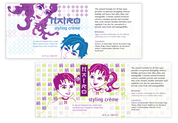
| My Role:
Freelance Hairo Product Label Designer & Illustrator,Conceptualist, Copywriter Comments: Represented above are two preliminary illustrations I created for my client Enzo & Company on Newbury Street, Boston for potential use as a hair styling product label design wrapped around an 8 oz bottle for their "styling creme" product. The designs would be printed on clear labels. Enzo & Co. developed eight products and requested unique label designs for all their products. My client worked with an established chemist to develop their own exclusive formula for their hair styling products. I wanted to create a European-Asian fusion feel for their product labels. I studied Japanese manga art style and created these two illustrations in a similar manga style for an asian pop-art feel. I chose a Japanese font for the product name “Hairo” logo concept. The manga art illustration depicting the children dressed as superheroes was intended to
play on the "hairo / hero" concept and show a powerpuff-like modern appeal that
may be appealing to young adult consumers both male and female in the high-tech and manga
art generation. I took the character for "silk" and repeated it over and over
again to create a background pattern. I laid out the Japanese-looking words "Hairo"
in this logo concept in a vertical position to suggest a Japanese hiragna or katakana character
set. The top manga art illustration was another approach toward the manga art concept but
featuring male and female young adults. I limited the design to two pantone colors to help
my clients reduce costs. I chose colors that I thought would be vibrant and colorful so
to attract a young and hip consumer base who are likley to discover this product while at
Enzo & Co. for a harcut or hair styling. |
||||